
Most Popular Kitchen Cabinet Colors in 2025
Styles for 2025 are widely diverse and yet hold one significant similarity – individuality. Boldness and practicality seem to go hand in hand as homeowners expand their color palette to deeper more saturated tones yet choose shades that evoke the feeling of comfort and adaptability.
Share
Paint and design companies all over are announcing their colors of the year and there seems to be a decided shift from muted neutrals to deep, rich, warm tones and soft shades of color. Even cabinets are seeing some extremes.
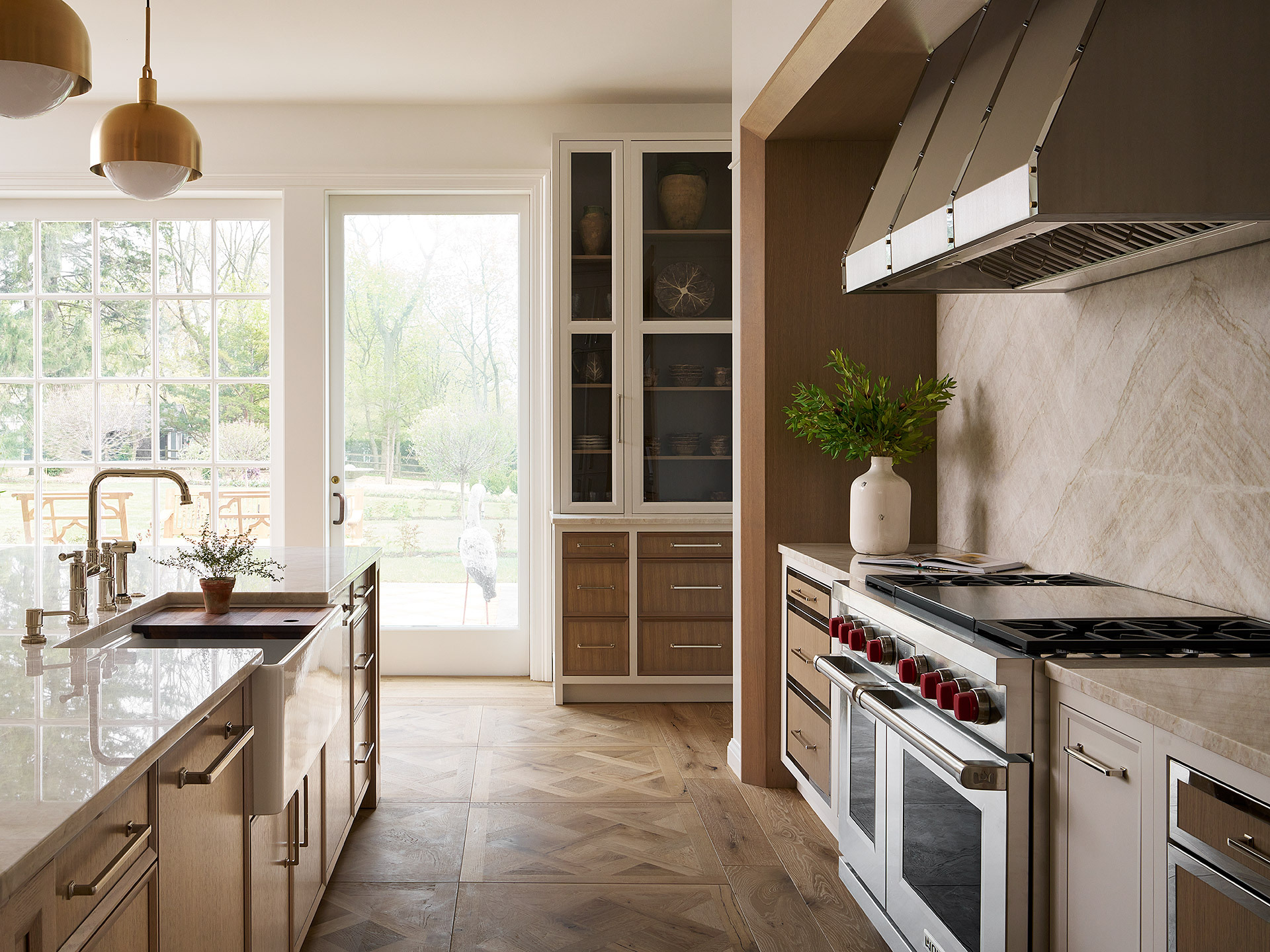
Where do cabinets fit in with color trends? 2025 may pave the way for even more color options incorporated into kitchen design. Earth reds, warm purples and soft yellows are showing up across design trends while blues and greens have solidified their right to be considered a neutral. White, the eternal classic is taking on more shades.
Plain & Fancy has never shied away from custom color – manufacturing over 400 annually. We strive to meet the extreme market demands for creative color solutions. We offer matching paints and stains for every vision and are confident in our durable, high-solid painted finishes. We believe that cabinets set the stage and are often the backdrop for color fusion in tile, flooring, and even appliances.
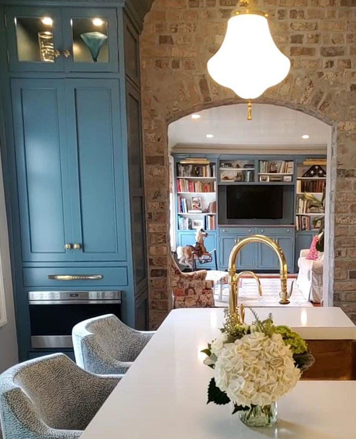
A SEA OF BLUE AND GREEN
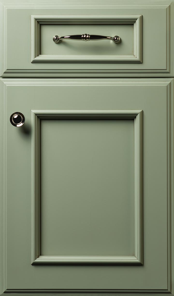
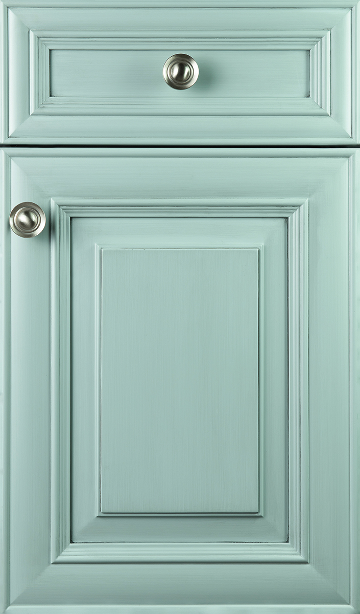
Blue and green cabinets aren’t going anywhere any time soon. More shades from light to dark have been added to this kitchen cabinet trend in 2025. Plain & Fancy has seen an uptick in both light and dark shades of both colors; from sky blue to deep azure and mint to forest green – a continuation from the tranquil blues and greens of 2024.
Connection to nature or as Sherwin Williams put it, “something real” has influenced the choice of stormy blue colors in kitchen cabinetry, like Sherwin Williams’ Rain Cloud and Benjamin Moore’s Stained Glass. And just like we see in natural ocean islands, the kitchen island is standing out as the color anchor and unique focal point of kitchen cabinet colors. The painted kitchen island could also be a nod to homeowners’ desires for truly timeless and iconic pieces in their homes. A painted island that is darker than the other cabinet colors speaks to authenticity and individuality.
Greens, like blue, echo nature of course and many color companies are choosing entire palettes of the year instead of single colors. Both green and blue reside in these palettes as both dark, mineral and deep sea tones; to tranquil, muted, moss greens and whisper- light blues. We are seeing more muted versions of the deep blues and greens as opposed to rich, saturated colors.
NATURAL RICHNESS
Deep, rich saturated hues that carry the implication of earth, cinnamon and brown and are popping up in cabinets, islands, flooring and walls in kitchens everywhere. The warmth and versatility of these colors seems to be what’s driving the trend. This surprising color palette that has been splashing its way across kitchens are reds and purples.
Sherwin Williams’ Colormixology podcast quotes Vern Yip as saying, “When you have a bit of warmth, it really does allow you to introduce all the other things that you love.” We are seeing many designers and homeowners approach these bolder colors as “adaptable” and a way to weave in other styles and details that may have been left out before.
Plain & Fancy’s color matching abilities allow homeowners to use these color pallets as inspiration for customized colors.
CHEERY STRENGTH
Nature has always influenced design trends and no less so than in kitchens. Airy, sunny and breezy aesthetics are coveted in kitchen design and cabinets often set the stage for a lightweight and open design plan.
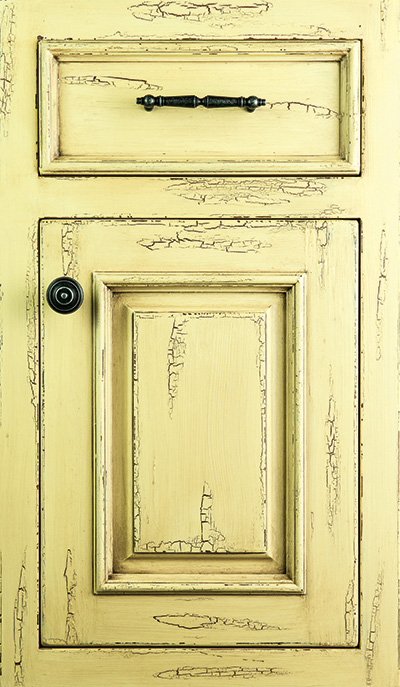
Yellows in soft shades like Sherwin Williams’ chartreuse are popping up in the nature-inspired color palettes of 2025. Don’t be surprised if you see a return to the cheery influences of warmer whites and soft yellows. The influence of Art Deco and modern vintage in design trends could be what’s influencing this re-introduction of soft yellows in kitchen cabinetry.
LIGHT HUES
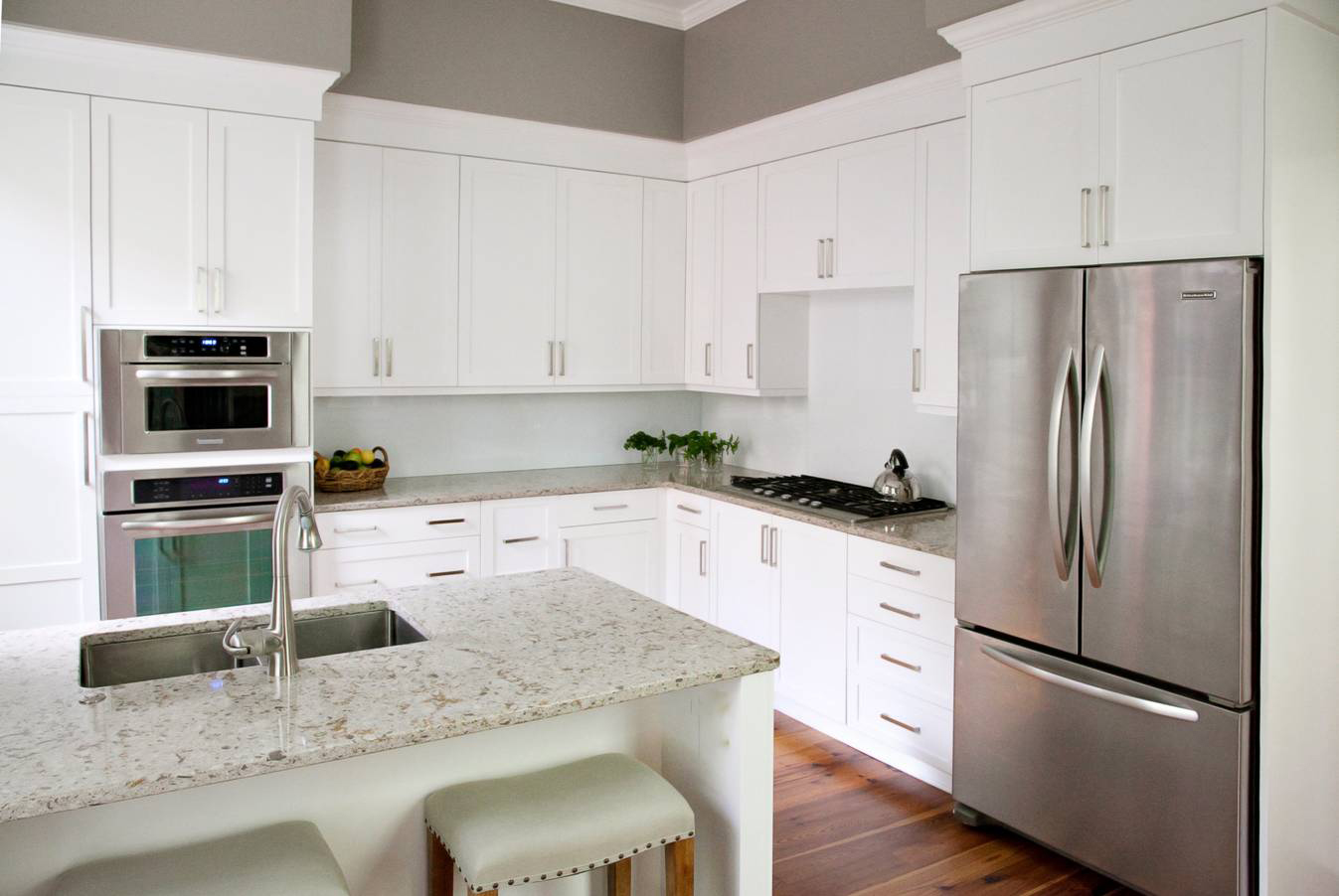
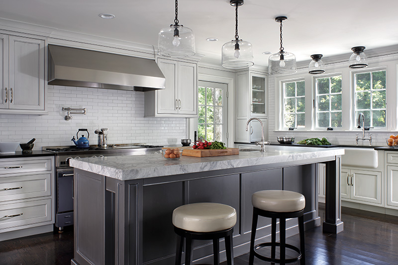
White will always be a number one kitchen cabinet color however, white has taken many iterations over the years. Instead of bright white cabinets we are seeing white take on sophistication with subtle shades of gray and tan resulting in a sun bleached or snow covered aesthetic that offers the perfect canvas for a pop of color from some of the colors we mentioned above.
White is familiar but it has a myriad of adaptations and applications that the homeowner can use to manipulate light and bolster other design details. These are earthier whites than the creamy, buttery tones of 2024 that lend themselves well to the deeper colors being introduced in kitchens. Nature inspires again as mineral and stone tones of gray seem to be the overarching influence in white kitchen cabinets in 2025.
WOVEN AND NATURAL INTEGRATION
Sustainability is driving design trends right now, pushing designers and homeowners to use more natural looking materials according to a 2025 prediction in an article in Woodworking Network’s magazine Closets & Organized Storage. In kitchen cabinet design we are seeing a desire for woven cabinet fronts. Mixed with color, this cabinet trend offers a one-of-a-kind style that holds both a timeless elegance and customized individuality.
LET PLAIN & FANCY BRING YOUR VISION TO LIFE in 2025
With design turning more and more toward individuality, now is the time to begin designing your dream kitchen in any color you can imagine. Plain & Fancy cabinetry dances on the designing edge of custom color and we are confident in our subtle sheens and smooth, soft-touch feel that enhance our paint options.
There is no color, finish or design we aren’t willing to develop with you. And while trends can spark inspiration, we believe that your kitchen should reflect you, your family's needs, and ultimately what will enhance a healthy and well-lived life. Contact us or find a showroom near you.
2024 COLORS OF THE YEAR
Nobody is obliged to stick with these trends completely, and, as Pantone Color Institute Vice President Laurie Pressman tells Veranda, "there are no rules; it is really about how one feels on any given day and what resonates at the moment."
This absence of rules will be the name of the game in 2024, which, in many ways, will represent a noteworthy continuation of trends that began to pick up steam in 2023. This past year, we've seen a shift towards earthy styles and colors, including a clear embrace of natural woods. This typically involves a contemporary twist, however, and both designers and homeowners are eager to bend the rules, at least a little.
At Plain & Fancy, we offer the best of both worlds: the ability to draw on the power of tradition along with opportunities to play with new trends. We're always enthusiastic about a classic look, of course, but in 2024, tried-and-tested styles can enjoy a wonderful refresh. To provide a glimpse at the unique styles that lie in wait, we've highlighted several of the most intriguing color trends of 2024, along with ideas to help you build these trends into your kitchen in a way that feels uniquely you.
Green and Blue Tranquility
There's no denying that the color trends of the last few years have been influenced by the pandemic and its aftermath. This largely reflects our ongoing search for serenity, especially in a world that often feels chaotic. The right colors truly can influence our state of mind, and increasingly, we aim to bring the calm of the great outdoors into our kitchens.
There are many ways to create a calming kitchen oasis, but in 2024, the most memorable tactics will involve distinct shades that rest at the intersection of blue and green. These tones are muted, rather than bright, but they have a unique effect: not only do they deliver the calm we crave, they can also be surprisingly invigorating.
Soft green cabinets were a big hit in 2023, and, while this remains an excellent option, we're seeing a subtle shift towards integrating hints of blue into these tones. Sherwin-Williams offers an evocative description of this trend, referring to it as the "crossroads of vitality and tranquility, change and constancy, intensity and calm...found in the spaces where blue and green converge."
While cabinets themselves can look lovely in various shades of green and blue, this style also works well for adding color to backslash or other kitchen elements. This can then be combined with on-trend hardwood cabinets featuring warm or earthy tones.
Fantasia Blue captures this concept perfectly, evoking the tranquil appeal of soft green with a hint of blue. This trend also provides a great opportunity to make the most of Plain & Fancy's custom colors.
Blissful Blue
There's a lot to love about colors that span the fine line between blue and green, but focusing exclusively on pale blue is also a great choice. After all, the Sherwin-Williams Color of the Year for 2024 is Upward, which is described as "breezy, blissful blue." This shade of blue is inherently calming, but there is also a playful element that will appeal to many. Springhouse offers a richer take on this concept that's ideal for who prefers slightly darker shades of blue.
Again, custom colors can bring the best of light blue to any kitchen, but like its more green-oriented counterpart highlighted above, this shade also pairs perfectly with natural wood. This is a great option for two-tone cabinets, especially in Scandinavian-style kitchens. If you're not quite ready to go all-out, consider combining scaled-back blue elements with white or cream hues such as Celeste or Dove White.
Blending Light & Warmth
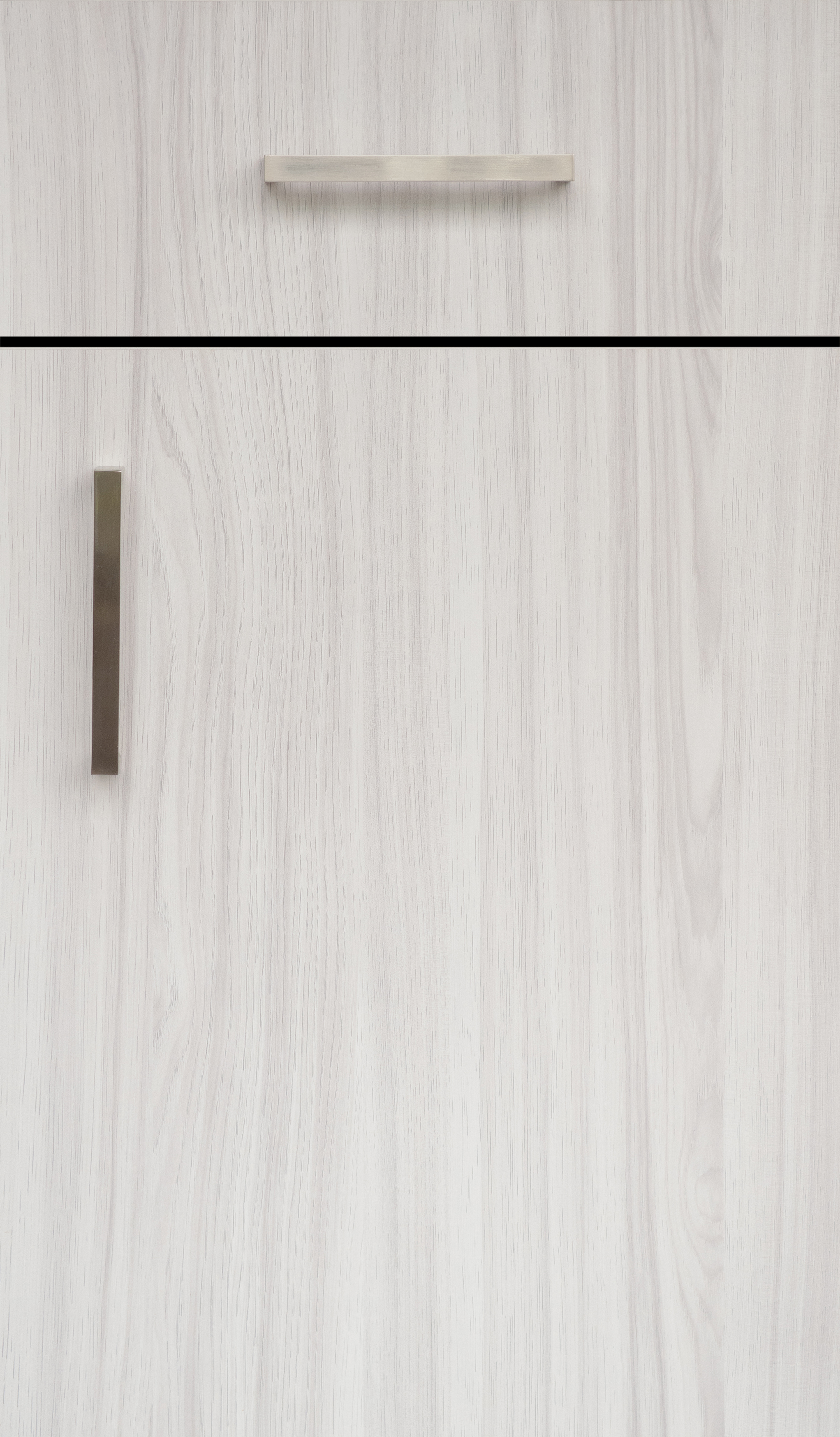
White's long reign as the go-to kitchen color stemmed, in part, from its unique ability to make the smallest spaces look and feel sizable. For this reason, classic white kitchens will always be in style. If, however, you crave a new tactic for harnessing the visually expansive effects of lighter colors, there are other options worth considering. When in doubt, look for something light and bright, but don't be afraid to draw on the inherent beauty and personality of natural grain.
Whether you go for the natural look or a painted alternative, it's clear that the white shades of 2024 will be creamier and, as Shermin-Williams puts it, more "soulful" than their crisper counterparts of yesteryear. This represents a continuation of a color trend we first noted at the outset of 2023, with options such as Butter Cream delivering a warmer take on the all-white concept. We also adore Frosted Trail and the Alps finish with rift-cut white oak.
Pops of color are always welcome, although this concept has been replaced, to some extent, by the growing trend of two-tone cabinets that emphasize both white and medium wood tones for a contrasted effect that feels warm and welcoming. As Shermin-Williams points out, light tones can be layered to bring a more dynamic appearance to monochromatic-inspired spaces.
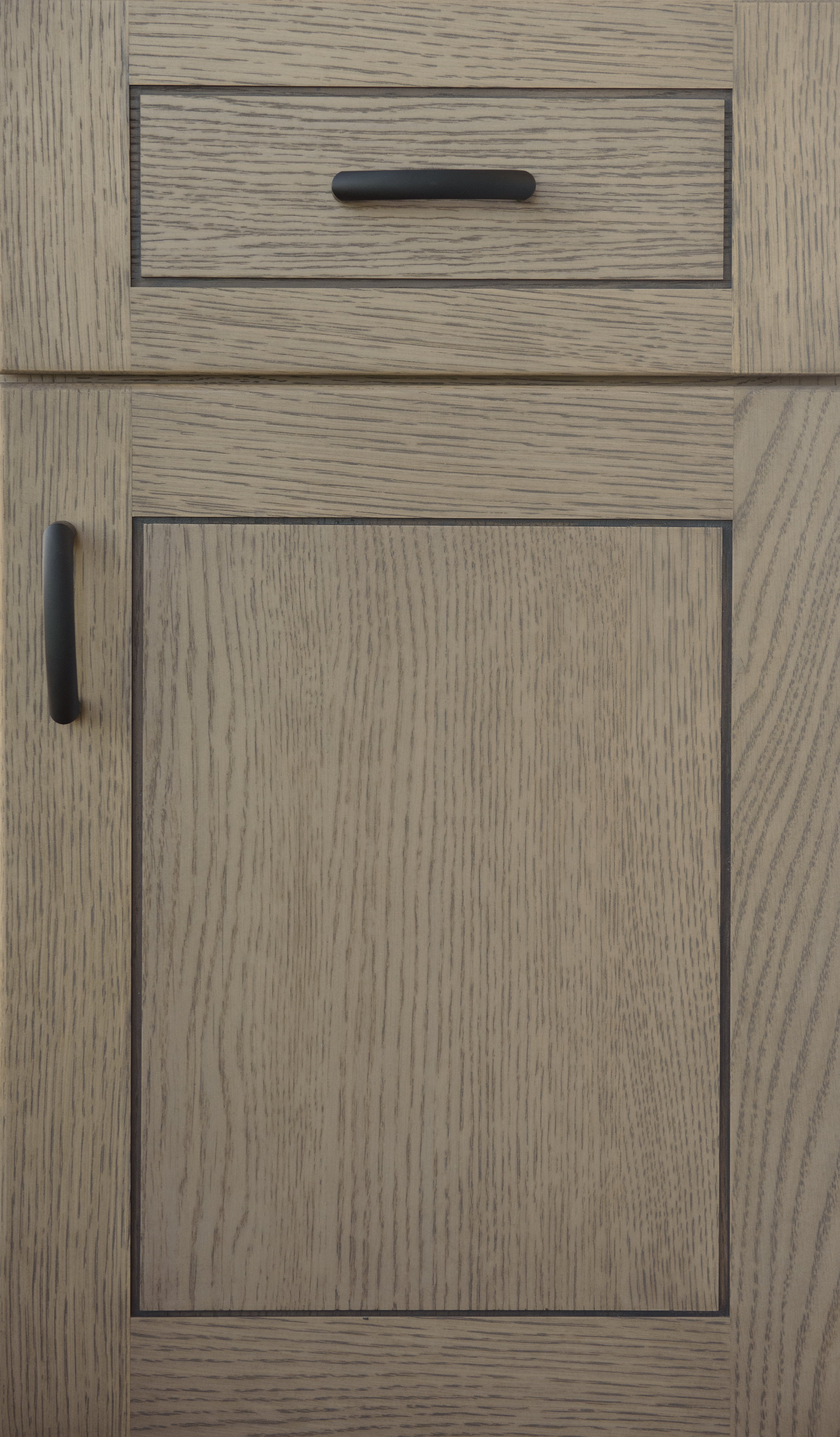
Versatile Medium Tones
The wood cabinet trends of 2024 run the gamut from light, farmhouse-inspired styles to richer and more sophisticated hues. Many homeowners, however, are seeking a middle ground: neutral earth tones that make the most of oak and maple. This provides a great opportunity to achieve a rustic aesthetic. A slightly lived-in look is favored right now, although any style can get a contemporary boost if accompanied by the right hardware.
These tones look gorgeous, of course, but there's also a practical element worth taking into account: medium-tone wooden cabinets hold up wonderfully to wear and tear and can also hide many of the unsightly fingerprints or general debris that other cabinets show so well. This should be a relief for anyone who craves a lower-maintenance lifestyle.
If there's a downside to this trend, it's the sheer struggle to choose between so many options. Many types of wood lend themselves well to medium tones, and a versatile range of finishes complement these cabinets. Each style brings its own unique personality to the table, however, and this can provide valuable guidance when trying to select between so many options.
Worth noting as we explore the power of neutral or medium tones in 2024: while these always have the potential to deliver a throwback feel, they can come across as downright contemporary with the right touches. This was evidenced in our work with the TV design team Brooke & Brice, who featured our cabinets and finishes on the show Making Modern.
During a much-needed pantry refresh highlighted in the episode Home Run Ranch, Brooke & Brice used rift-cut white oak with our Driftscape finish. This worked nicely with darker and more dramatic colors for the backsplash. In the kitchen area, walnut doors with a Natural finish again revealed that medium tones can work wonderfully with darker hues.
Whiskey Barrel is another favorite that brings comforting and even rustic vibes to the forefront — but also feels on-trend. This was one of our favorites in 2023 and will still be a hit moving forward. It's a great option for rift-cut white oak, cherry, and walnut doors.
Integrating Wood and Painted Cabinetry
Mixed materials were all the rage in 2023, and we're pleased to say that this purposefully eclectic approach will remain front and center for quite some time. We've already touched on a few of the most approachable options for playing up this trend, including the fresh feel of white with medium-tone wood cabinets.
In 2024, we'll see more innovative takes on the alluring idea of combining finishes and materials. Insiders at House Beautiful reveal an exciting possibility: "cabinet towers in stained wood with lower cabinets in a painted finish." Additionally, there will be a greater willingness to blend medium and dark tones to produce richer and more sophisticated spaces. Brooke & Brice love this idea, as evidenced by the use of dramatic Peppercorn and the lighter-colored Natural finish.
Create a Kitchen You Love in 2024
If you enjoy experimenting with kitchen color trends, you're in luck: there is truly something for everyone in 2024. No matter which aesthetics you find appealing, you'll discover stunning finishes that amplify their effect. Better yet, you will have numerous opportunities to build calming elements into your kitchen so that this can feel like a place of respite.
As you begin to source ideas, don't hesitate to chat with our team at Plain & Fancy. We feel that trends can form the basis of excellent kitchen concepts, but ultimately, we believe that the ideal kitchen will reflect your own unique sense of style. With our guidance, you can get a better sense of the various color concepts you find genuinely appealing — and if these align with the latest trends, that's great! Otherwise, we always appreciate a classic look.
Feel free to visit our showrooms and draw inspiration from today's top styles. We'd love to discuss your vision, so don't hesitate to get in touch.
2023 COLORS OF THE YEAR
Color trends are constantly shifting — and what, exactly, is in style can differ depending on who you ask. Many people look to the concept of the color of the year for insight. Several colors of the year exist, however, and these often seem to have little rhyme or reason. Every year, evolving color trends reflect our collective experience and desires for the future. This was especially obvious during the peak of the pandemic, when we sought calm in a time of uncertainty. Tranquility remains important in 2023, but we also want to express our true selves as we move into a new phase. Hence, the rise of bold designs, retro throwbacks, and all kinds of styles that felt inaccessible a few short years ago.
If there's a theme for 2023, it's anything goes. That's right — this year's hues occupy all areas of the color spectrum, ranging from long-time favorites such as white to throwbacks (like brown) and soothing colors that reflect the best of biophilic design. Many daring colors are also fair game this year, so be prepared to show off your distinct personality with vibrant cabinets and accents that feel true to you.
If there's a downside to this range of trends, it's that narrowing down your options can feel tricky at times. We're here to help. We've outlined several of the biggest cabinet color trends for 2023, as well as practical ways these can be applied.
The goal? To deliver a fresh feel in keeping with our current desire for connection and creativity — but to also provide a timeless aesthetic that you'll continue to adore far into the future.
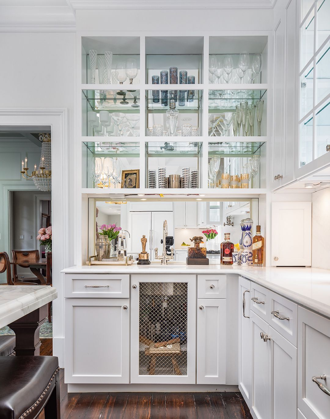
WHITE REMAINS KING
Crisp, clean, and contemporary, white remains one of the best options for establishing an inviting kitchen. The all-white aesthetic may have been dominant during the early 2000s, but it certainly hasn't disappeared. These days, homeowners are beginning to realize that there's far more nuance to white than they previously assumed.
At Plain & Fancy, we are always passionate about white, although we encourage homeowners and designers to think carefully about the full range of choices. Opting for a mostly-white design is only the first step — you'll still need to look closely at textures, accent colors, and the general flow of your space.
Remember: the goal with white cabinets is not only to form a contemporary, visually appealing aesthetic, but also, to design a welcoming space that will meet all your needs both now and far into the future.
Done right, white can bring a surprising degree of warmth and calm to your space. In 2023, this often means mixing and matching with grounding tones or hues that reflect your unique personality.
Options worth exploring include:
- Butter Cream. The earthy era of 2023 calls for warmth. This will be in abundant supply if you deck your kitchen out in rich Butter Cream.
- Cascade White. Not as overtly creamy as the appropriately named Butter Cream, Cascade White is perfect for calling attention to details, such as beaded insets cabinets.
- Garden Gate. Blue-ish tones are still in, so Garden Gate works when you want to bring a unique element to your white design.
GRAY'S NOT GONE YET
While we're starting to see a slight shift away from the gray tones that dominated the late 2010s, there's still plenty of room for this versatile color. Gray has by no means disappeared, but how we approach this color is starting to shift. Red undertones should bring more warmth to this hue, appealing to those who might otherwise opt for earthier tones.
Dutch Boy exemplifies this approach with its color of the year: Rustic Greige. Undeniably comforting, this gray-ish color is an excellent option for anyone who naturally gravitates towards neutrals but wants the ability to add all kinds of accents. It's unique in that it works well with both warm and cool tones.
Gray has long been a dominant theme at Plain & Fancy, as we appreciate its versatility. Examples include:
- Vista Gray. There's no need for gray to feel stark or cold. Soft and comforting, Vista Gray can bring a surprisingly warm feel to a contemporary or transitional kitchen.
- Stone. If you favor lighter kitchens but desire a dose of gray, let the light in with Stone. It allows you to make the most of the ongoing gray trend but will also make your space feel open and airy.
EARTHY TONES TAKE OVER
Warm shades of brown have attracted a lot of attention these last few months and, if Sherwin Williams' 2023 ColorMix is any indication, these will become even more prominent moving forward. Rich and inviting, these hues bring a sense of warmth to any space in which they're featured — an increasing priority for those who want their homes to feel as cozy as possible.
The emphasis on earthiness is best reflected in the selection of the hue Redend Point for the Sherwin Williams Color of the Year. Described as a "soft and soulful natural," this option emphasizes compassion and connection — qualities that we are clearly craving in 2023. The colors recommended for pairing (such as Cool Beige) also bring a modern edge to the earthy aesthetic.
The shift towards earthy colors works wonderfully with several of the overarching trends identified by Houzz. Modern rustic, for example, is taking over in a big way, with natural materials emphasized while contemporary details such as steel appliances help these spaces retain some modern appeal. Similarly, many designers are eyeing a uniquely modern take on the farmhouse trend, which can be both cozy and sophisticated.
In keeping with this shift towards earthier styles, the stain lineup at Plain & Fancy now features many appealing brown tones. These can be paired with a variety of lovely accents, including everything from soft, dusky hues to bolder designs that call back to iconic 70s aesthetics. If you love the natural details of hardwood, this is your time to let earthy styles shine. Give these a try:
- Cocoa. Perfect for a variety of wood types, Cocoa is a versatile option that can capture earthy vibes while also drawing on the darker styles we'll discuss later.
- Whiskey Barrel. Take on rustic vibes with a book that's both laid-back and curated. Whiskey Barrel is a rich option that feels comforting, not overwhelming.
SOOTHING SHADES OF GREEN REFLECT BIOPHILIC DESIGN
Biophilic concepts are trending in the interior design community, where there's a clear desire to bring the best of the natural world indoors. The recent shift towards earthy tones fits in well with this trend, but shades of brown are by no means the only colors capable of establishing outdoorsy vibes. Green also accomplishes this end, creating a lush feel. This calming, yet energizing hue works wonderfully as an accent, especially when paired with the aforementioned earthy tones.
Houzz emphasizes the increased interest in green (especially for cabinets) in its comprehensive list of design trends for 2023. Many shades of green will be considered on-trend in the coming year. These include not only deep, forest-inspired hues, but also, lighter shades such as mint. Both pair wonderfully with brass hardware.
We're loving the range of green shades cropping up in the Valspar 2023 collection. The olive hue known as Flora is a key offering for the upcoming year, while the hazy Green Trellis offers plenty of contemporary charm. Other excellent options include:
- Wandering Vine. This gorgeous hue brings personality to darker kitchens but is also highly soothing. It's a solid mid-tone option if you don't want to move into the deepest greens just yet.
- Maple Mystic Green. Simultaneously serene and energizing, Maple Mystic Green brings the best of both worlds to your space. It fits perfectly with the vibes of 2023: a desire for something slightly daring, but also, a need for calm.
CALMING BLUES HELP US RELAX
Navy was a big deal these last few years and is still a welcome possibility for the time being. This trend is starting to give way, however — and in 2023, top shades of blue will feel a bit earthier. That's right: blue can be seriously earthy if it has the right undertones. Blue undertones are also a great option, as seen in the aforementioned Garden Gate. Other options to embrace in 2023 include:
- Triton Blue. A hint of smoky gray makes Triton Blue an appealing option for a modern kitchen. It feels peaceful but can also go a long way toward establishing the clean, contemporary look you crave.
- Blue Brush Mark Crackle. Bring blue into a rustic style with help from this specialty style. This will instantly make a statement without overwhelming your space.
DARK & DARING HUES
Contrasting the enduring popularity of white and the recent move towards earthy aesthetics, daring colors such as charcoal, iron ore, and black are attracting a lot of attention from a specific subset of homeowners and designers. Not just anybody can pull off this look — but when it works, the end result is downright mesmerizing.
Dark colors can be surprisingly versatile. Styled right, they may feel edgy, sophisticated, or minimalistic. There are few better opportunities to show off your personal sense of style.
If you worry about mostly-dark colors making your space feel smaller, feel free to use them as an accent or build in contrast. Insiders at House Beautiful remind us that two-tone cabinets will remain a big deal in 2023, so it should be easy to combine dramatic colors with contrasting hues.
For 2023, dark colors can be applied in almost any fashion imaginable. As rich hardwood takes over, dark stains will become extra appealing. Painted cabinets remain a viable option, however, with sleek shades bringing plenty of drama to any space.
We love dark colors and think they can be an elegant addition to any space. Top options include:
- Espresso. This deep shade pairs perfectly with creams to create a rich space that also feels undeniably classy. You'll instantly fall in love with the elegant look, which will stand the test of time.
- Peppercorn. Go all-out with the drama and incorporate Peppercorn in your next kitchen. This look will make a statement in the best possible way.
- Tamarind. This was a showstopper in 2022, but it's certainly not going to disappear in 2023. It's a compelling option for a standout kitchen but also provides a hint of warmth.
INCORPORATING MIXED MATERIALS
No discussion of 2023 cabinet colors would be complete without a reminder that mixed materials are not only acceptable, but practically expected this year. This is an exciting opportunity, as it brings far more versatility to the modern kitchen and fits in perfectly with the current popularity of transitional design.
As House Beautiful points out, cabinets themselves will increasingly be constructed from mixed materials, such as blends of wood and metal. Integrated metalwork is one of the most distinctive takes on this trend, but we expect to observe many other creative blends in the near future.
CHOOSING THE PERFECT CABINET COLORS FOR 2023 — AND BEYOND
With so many options to choose from in 2023, finding the right cabinet color and style may feel overwhelming. Ultimately, however, it's worth remembering: trends can provide guidance, but the best cabinet colors are the ones that make your home feel like a personal oasis, not to mention an appealing place for gathering with loved ones. While you can certainly keep an eye on the trends, you'll also want to consider materials, patterns, and the size of your space.
Most important of all, of course, are your own unique preferences — if a particular style feels right for you, it ultimately doesn't matter if it's on trend for 2023. Still, that's what's so amazing about the upcoming year in interior design — there's an increased acknowledgment that no one style is going to appeal to every individual or family, nor should it. This enhanced versatility will make playing with trends even more compelling in the year to come.
Remember: our team at Plain & Fancy is always happy to provide the insight you need as you plan your dream design. Don't hesitate to reach out and learn more about our vast range of colors and finishes. If you'd like to see our work in action, stop by one of our showrooms or check out our design center in Schaefferstown.
If you seek insight on color trends from ten different paint companies or high-end designers, you'll receive ten different opinions as to which hue is the hottest of the season. Many companies struggle to select just one option, often settling on a full spectrum of colors that reference not only their own preferences, but also, where their clients and customers show interest at any given time. Geography can add further trend-based variety; the looks that resonate in New York, for example, might not catch on as quickly in Chicago, Miami, or other style Meccas.
On a national level, the media tends to hype up color of the year designations, and with good reason: an authority announcing the annual hue makes for a great headline. These stories guarantee reader interest, as people love to speculate on the latest looks.
Given all this, any colors of the year we reference at Plain & Fancy should be taken with a grain of salt. We enjoy discussing the hottest hues of the season but also acknowledge that trends alone may not be sufficient as a basis for your cabinet selection process. It's important to consider other factors, including durability, room size, interest in patterns, and, most importantly, your personal preferences.
If you're not fond of a particular color or it simply falls short of reaching your grand vision for your upcoming design project, it's perfectly fine to abandon the latest trends — especially once you realize how much these vary and as such, how difficult it is to remain at the cutting-edge of interior design. Still, with help from the experts at Plain & Fancy, you can make the most of this year's trends while also achieving an enduring look that you'll love not just now, but in years to come.
OVER 50 YEARS & WE STILL BUILD EACH CABINET ONE BY ONE!
2022 COLORS OF THE YEAR
A new year means new colors to explore. Following suit with the natural, warm tones of 2021, we can expect to see some riffs and evolutions in what designers and their clients are gravitating towards, with some new players added to the mix as well.
Whether you are hoping to refresh your space, or embarking on a fully fledged renovation project, these colors will set the scene for an end result that’s sure to please. These colors are a combination of the leading paint providers as well as a look at the Plain & Fancy colors that have been loved the most so far this year.
Gathering inspiration for your home is fun, but it can often feel like the options are endless. With this guide you can get a sense of the overarching themes before committing to an exact color choice. Of course our design team is always happy to help you with every step of the process and would love to hear about the dreams you have for your kitchen.
TOP COLORS FROM THE P&F DESIGN LAB
MID-TONE GREEN
Fresh, earthy greens play so well in a kitchen, contributing to a relaxed ambiance. They inspire creativity and fun while still remaining grounded and reassuring. This year, we will see the mid-tone greens popping up in kitchens and offering something a little different than the darker, more royal emerald tones that have been enjoying their hayday. The Plain & Fancy website has received the most traffic on mid-tone greens over the past year and is expecting this trend to continue.
Here are some of the highlights:
- Wandering Vine. This color is a whimsical and refreshing green that will seamlessly enliven your space. Paired with other natural colors and textures, it serves as a distinctive cabinet color or can also be used in subtle ways in other areas of the kitchen such as an island.
- Terra Green. More of a muted, mossy green, Terra works well to balance out a dark kitchen that is and infuses some personality.
- Daydream. A grey-green reminiscent of lichen, Daydream looks stunning in a variety of settings. A refreshing and energizing color choice.
BLUE
Blues are classic in any room of the house and especially the kitchen. Refined and sophisticated, these tones are becoming even more popular in 2022. Taking a look at the specifics, designers are seeing a trend towards the darker blues which add depth when paired with neutrals such as white or cream and can be modified to create a variety of themes and aesthetics.
- Triton Blue. Blue with undertones of smoky gray, this color works wonderfully in endless contexts. Receiving views on Plain & Fancy’s website and across the design world, it has captured people’s attention with its dynamic beauty and versatility.
- Spring House. Moving to the lighter side of the spectrum, spring house is also set to make an appearance this year. Playful, curious and full of life this color will add instant personality to your home. When paired with neutral darks, Spring House offers a brilliant accent and optimism to your kitchen.
- Belair. The lightest of the top three blues this year, Belair has a slate blue quality reminiscent of a traditional Americana style but remains versatile enough to shine in modern kitchens too.
NEUTRAL & WHITE
It’s no surprise that white is still a top choice for kitchens. With an unmatched clean and timeless look and ability to make small rooms feel more spacious, all signs point to this remaining the direction for people to go for their kitchens. The great part about paint colors, however, is their endless customization ability. With just the slightest bit of nuance, the white you choose can make a big difference in the tone the space communicates.
- Dove White. Warm and buttery, we love how this white has a depth that creates interest and character.
- Cascade White. Also on the warm white side, Cascade plays beautifully with earthy tones and metal accents.
- Garden Gate. Has a bluish tint, pairing nicely with cool tones and dark wood and stone.
DARK WOOD STAIN
Plain & Fancy has an impressive array of cabinet stains and glazes in addition to paint options. With the natural blues and greens gaining popularity this year, dark wood stains are expected to be the go-to complement.
- Tudor. Bold, royal, and grounded, this stain adds instant elevation to a kitchen and adds equilibrium against lighter airy colors.
- Tamarind. Gaining much popularity in 2022 is this stunning, this is a dark stain that will be a showstopper in your kitchen.
- Cocoa. As the name implies, this is a rich chocolate stain, taking well to all wood types and cabinet styles.
SHERWIN WILLIAMS
A versatile color that appears a little different depending on what it is around, Sherwin Williams color of the year, Evergreen Fog SW 9130, is a green-grey with the tiniest hint of blue. When used in large areas, it makes quite the statement but is also flexible enough to be a complimentary color that is refined and subtle.
Sherwin Williams suggests pairing Evergreen Fog with natural earth tones such as their Soji White, Urbane Bronze (last year’s SW color of the year!), and Uber Umber. This pallet is calming and brings a refreshing look to the home.
VALSPAR
Valspar’s 2022 color collection includes twelve timeless colors that feel bright and optimistic. Aligning with the nature theme, they seek to bring a “calm, comfortable presence into your home.” Whatever your affinities are, you are sure to find something that sparks your interest in this lineup. Blues and greens are present along with some yellows, pinks, and peaches.
- Blanched Thyme. Leading Valspar’s colors this year is another mid tone green. This shade is similar to Wandering Vine, but with a slightly lighter, heathered quality.
- Gilded Linen. Clean and neutral like freshly laundered fabric, this color is perfect in any room and has a soft edge.
- Delighted Moon. “A color that radiates warmth” as Valspar’s Color Marketing Manager, Sue Kim says. Very different than any of the other colors we have seen so far, this sunshiney yellow is bound to make a welcome debut.
- Lilac Lane. Cheerful and luxurious, this color would work nicely as an accent in an open concept kitchen paired with variegated stone.
- Mountain River. Is a deep blue that stands out and catches your attention. Valspar recommends Combining it with warm wood tones and red-based lilacs.
- Orchid Ash. Simple and timeless, this shade is practically made for cabinets. Pair with metallic hardware for added charm.
- Grey Suit. Not far off from Sherwin Williams Evergreen Fog, Grey Suit has hints of red undertones that are warming and reliable.
- Subtle Peach. Moving to the pasel side, this color has a youthful flair. Combine with greige wood tones and brass accents.
- Rustic Oak. Rich and warm, giving a nod to the surmounting mid century modern trend. Interacts nicely with neural tile and dark wood stains.
- Sunset Curtains. Living between peach and a light terracotta shade, Sunset Curtains will invigorate your home and add a feeling of reassurance.
- Country Charm. Like freshly churned butter, this natural hue is a go-to for kitchens.
- Fired Earth. This color is one of the darkest of 2022’s colors, making it stand out in the crowd. Add lighter colors for a sophisticated and bold look.
FARROW & BALL
Farrow & Ball has selected five colors for 2022 that will be popping up across the design world.
“There is something inherently human in the colours that we are attracted to for 2022, as well as in the way we use them,” Colour Curator Joa Studholme says. “Décor is moving forward while drawing inspiration from the modest character of the world of folk and craft, using five significant shades that extol the virtues of a simple life and can be used in any combination and in any room.” Take a look at the selection:
- School House White. Classic white to accompany any of the other colors or stand alone.
- Babouche. Reminds us of Van Gogh’s sunflowers and is a happy, unapologetic color.
- Breakfast Room Green. “Named after the usually east facing rooms designed for eating the first meal of the day, it is particularly beautiful in the dawn light,” notes F&B. Lovely for kitchen spaces of all kinds.
- Stone Blue. With a vintage aura, this blue is quite saturated and similar to the trending P&F blues we covered earlier.
- Incarnadine. This crimson color is single handedly representing the red side of the spectrum and we love to see it. Possessing a 70s flair, F&B speaks to its adaptability and capacity for edginess.
WHAT COLOR WILL YOU GO WITH?
Now that you have an overview of what colors are in the spotlight for 2022, it is time to decide how you will use them to help inform your upcoming projects. Choosing a color for your home is personal and requires thoughtful consideration; everyone has their own preferences and aesthetic freedom. Our design team at Plain & Fancy is always happy to help you explore options and find something that will make you fall in love with your space. The best part is you don’t have to choose just one! Colors are meant to interact with one another and play on the textures and styles around them.
Like any kind of growth, the colors of the year are a snapshot in time, with some carrying over from the past and others leaping ahead. Instead of feeling the need to pick a color that is trending, go with your gut and pick something you know you will be satisfied with for years to come.
2021 COLORS OF THE YEAR
We may be skeptical of the concept of the color of the year, but we still believe that these selections can be a great source of inspiration. If you're at a loss for ideas, the latest collections of trending colors may get you on the path to your ideal hue. You'll find plenty of exciting options for 2021 — especially if you're fond of warm or earthy tones.
Not sure where to start? Below, we've highlighted a few of the most noteworthy designations from top color authorities, including today's most trusted paint providers.
SHERWIN-WILLIAMS
Sticking with the preference for grey-oriented neutrals that has dominated the industry in recent years, Sherwin-Williams selected a versatile look for its 2021 color of the year: Urbane Bronze. This simple tone reflects a growing need for serenity within the often complex world of interior design.
At first glance, Urbane Bronze might not seem particularly exciting, but look again and you'll be struck by its calming nature — exactly what you and your loved ones need in 2021.
As the Sherwin-Williams color marketing director explains, comforting and adaptable colors such as Urbane Bronze make it easier to establish the home as a personal haven during times of uncertainty. Still, this look should have no trouble remaining relevant in the future.
To make the most of Urbane Bronze, be sure to layer with complementary tones, including not only beige paints, but also, white oak or ash cabinets.
Copper and wrought iron details can instantly add a hint of sophistication to any space decked out with this neutral hue.
VALSPAR
Rather than stick with a single color for 2021, Valspar has opted for twelve muted hues, all of which encourage the peace of mind that we so desperately need in the new year. Referred to by the company as "fresh and familiar," these colors aim to make you feel as cozy as possible while still delivering a slight edge of energy.
While this year's Valspar paints cover the full color spectrum, all have a soft, comforting feeling. Shades of blue, grey, and cream are heavily represented, but there's something for everyone in this modern collection. Key colors include:
- Unforgettable. This warm, welcoming take on white brightens up spaces while also helping them feel grounded.
- Gallery Grey. Combining the neutrals and the warm tones that have been popular as of late, this gentle color is easy to integrate in a variety of spaces.
- Granite Dust. Echoing the best qualities of natural stone, this desirable shade of grey feels both sophisticated and relaxed.
- Academy Gray. This deep take on gray features a bluish tint that beckons you to relax and enjoy the small, quiet moments we so often take for granted.
- Garden Flower. Move beyond the stark whites of yesteryear with a natural tint designed to reflect white roses and other garden favorites.
- Maple Leaf. Bringing a natural, warm feel to the neutral concept, this relaxed hue has a familiar aesthetic that makes it a great choice for establishing a homey atmosphere.
- Soft Candlelight. If you like the idea of incorporating yellow in your kitchen but feel a bit ambivalent, this soft take on the cheerful hue should help you make the necessary leap of faith with confidence.
- Lucy Blue. Evoking the wide-open beauty of ocean scenery, this shade of blue can instantly bring the outside in.
- Blissful Blue. Shades that blur the lines between blue and gray have been picking up steam for a few seasons. Valspar's Blissful Blue has lovely indigo tones.
- Dusty Lavender. Romantic yet soft, this tone proves that pastels can cut it as both trendy and timeless.
- Cherry Taupe. Like Dusty Lavender, this color has a romantic look but is soft enough to not feel overwhelming.
- Arizona Dust. A relaxed take on apricot, this color works well with hardwood, making it a nice option for highlighting the natural grains of your cabinetry.
FARROW & BALL
Like Valspar, Farrow & Ball designates a variety of colors of the year. These shades tend to be earthy, although several rich colors are also included for 2021.
This year's favorites reflect a general preference for warmer tones over the cooler looks that once dominated color of the year selections. Chosen by curator Joa Studholme, these tones cover the gamut, bringing both comfort and adventure to the homes and other spaces in which they're incorporated.
This year's versatile colors from Farrow & Ball are divided into four distinct categories. These include:
RICH AND WARM
The most indulgent of Farrow & Ball's colors of the year invite you to pamper yourself a little. You deserve to relax in a rich and welcoming environment.
- Deep Reddish Brown. Representing a move away from the charcoal look that has recently dominated contemporary homes, this warm shade of brown has a deeply soothing feel.
- Tanner's Brown. Deliver a blend of comfort and sophistication with this chocolatey tone, which Joa Studholme recommends for shelving.
- Preference Red. This luxurious shade of red feels deeply indulgent. This makes it great as a pop of color in a sea of neutral, but it's not too brash to use as a dominant tone.
CLEAN AND TIMELESS BLUES
The right shade of blue is always a winner in a relaxed environment, but this collection can also work nicely in formal settings if paired with rich, contrasting woodwork.
- Pitch Blue. Add a lively take on blue to your favorite indoor space. A hint of purple takes this version of cobalt to the next level.
- Stiffkey Blue. A reminder that cool undertones remain relevant in 2021, this take on navy perfectly captures the beauty of the Norfolk beach for which it's named.
- Ultra Marine Blue. As calming as a day on the coast, this nautical color will attract attention with its fresh feel.
- Scotch Blue. Delightfully inky, this deep blue provides a great replacement for the cool shades of gray that were so popular in the past few years.
EARTH COLORS
By now, it should be no secret that earthy shades are a big deal in 2021. It's only fitting, then, that this preference is reflected with a dedicated collection of Farrow & Ball colors of the year.
- Jitney. Blending the best of neutral standards brown and gray, this organic tone has an uplifting feel that will instantly raise spirits on a dreary day.
- Dead Salmon. Don't be put off by this color's unusual name. It's meant to reflect the "dead" or flat finish of the aged pink from the historic Kedleston Hall.
- India Yellow. This exotic hue offers a hint of calm that makes it a wonderful alternative when you desire the versatility of white but also crave a little more visual interest than a conventional neutral can provide.
NATURAL GREENS
If you constantly crave time in the great outdoors, you'll love the forest feel of these shades of green:
- Green Smoke. This deep and smoky color was a big deal during the late 1800s but can still achieve a contemporary feel that emphasizes tranquility above all else.
- Treron. A dark version of the Farrow & Ball favorite known as Pigeon, this deep green hue works well in modern homes that feature several elements constructed from natural materials.
- Sap Green. As an integral part of the Color By Nature collection, this organic shade of green brings a rich, outdoorsy atmosphere to a variety of interior settings.
CHOOSING THE BEST COLOR OF THE YEAR FOR YOUR HOME
With so many different colors supposedly hitting it big in 2021, keeping up with the so-called trends can be difficult. How can you create a stylish interior when you don't actually know which look is on-trend? Another important consideration: which colors will remain relevant when 2022 arrives, along with its many new colors of the year?
Ultimately, the color of the year concept fails to take into account the individual's unique needs and aesthetic preferences. This problem has been mitigated to an extent with the establishment of color collections, but even these neglect to capture the full range of possibilities available when a specific trend takes over.
Rather than blindly follow the trends referenced by a particular paint manufacturer, consider a more nuanced approach that makes sense based on your design plans. Our team at Plain & Fancy can guide this process. Our designers love to collaborate; they take the time to get to know each client before offering well-informed recommendations. You'll adore the colors, textures, and styles they highlight. Of course, if your heart is set on a specific color from 2021, you can count on our experts for a great match.
2020 COLORS OF THE YEAR
Kitchen design is constantly evolving. Color trends, in particular, tend to surface in kitchens before they hit other areas of the home. At Plain & Fancy, we're well aware of the latest crazes in kitchen design — and while we're always excited to see style updates, we're especially loving the inspiring aesthetics in store for 2020.
Color palettes, in particular, are starting to shift, with several beautiful, yet accessible hues making their way into today's most impressive kitchens. Sherwin Williams, Benjamin Moore, and Pantone have all released noteworthy colors and collections, several of which we're already seeing in today's most up-to-date kitchens.
With so many options available, choosing the right shade can feel overwhelming. We're here to help. Below, we've outlined a few of the biggest kitchen cabinet color trends set to make their mark in 2020, as well as accessible options for incorporating these lovely hues into your space.
THE ZEN APPEAL OF EARTHY BLUES AND GREENS
Soft, peaceful colors will dominate kitchens in 2020. Stressed by the craziness of modern life, homeowners are more eager than ever to incorporate an element of zen into their personal space. This can easily be accomplished with the right colors. Earthy shades of blue and green, in particular, can make any room feel like a safe haven. These muted colors bring the peaceful vibes of a yoga studio into the kitchen.
While earthy colors have traditionally been reserved for bedrooms, bathrooms, and other peaceful enclaves, they're quickly making a splash in virtually every aspect of the modern kitchen. We're thrilled to see these hues represented and the following are just a few examples of peaceful, down-to-earth hues we expect to take over in 2020:
SHERWIN WILLIAMS: NAVAL
As Sherwin Williams' Color of the Year, Naval reflects a growing emphasis on quiet confidence, especially among those who realize that bold looks can still be grounded. This hue also intends to inspire a "fresh decade of change." It allows homeowners to achieve a crisp, clean look without opting for the all-white aesthetics that dominated kitchens of the past decade.
PANTONE: CHIVE AND NAVY BLAZER
While Pantone's 2020 color palette includes a wide variety of hues, several are in keeping with the earthy emphasis that we've already observed. This is especially true of Chive, which, according to Pantone, aims to impart a "healthy and restorative harmony." This deep shade of green has a distinctively herbal look, which grants it a meditative feel.
For summer, Pantone is emphasizing Navy Blazer — a self-assured shade of blue reminiscent of the Sherwin Williams Color of the Year. Sophisticated, yet grounded, this versatile color will feel right at home in a variety of 2020 kitchen designs.
COMBINING WHITE WITH POPS OF COLOR
There is a lot to love about a simple, white kitchen. Clean and crisp, this go-to color can give even the tiniest room a spacious feel. It's easy to see why white has dominated kitchens for over a decade — and why, as the ultimate classic kitchen color, it's capable of standing the test of time.
We adore white, but there's nothing wrong with adding a little extra color. The right kitchen design allows you to capture the best of both worlds: the crisp look of white and the vibrant beauty of bold colors. Options abound for highlighting trendy colors in kitchen cabinets. Two-tone styles offer a bolder look while still remaining decidedly versatile. In 2020, pops of color will deliver a fresh feel in white kitchens. The following hues, in particular, should prove transformative if used sparingly:
TURQUOISE
Turquoise may not be the first color that comes to mind when you picture a stylish kitchen, but that's about to change. Why reserve this stunning look exclusively for your jewelry collection?
LEMON
Bright, clean, and cheery, lemon brings much-needed zest to kitchen environments. It's best used sparingly, of course, but the right details can bring an otherwise simple and straightforward space to life.
Lemon pairs wonderfully with white but also looks lovely alongside other neutrals. It's a great option for kitchens that lack natural lighting, as it can make any space seem lighter and more cheerful.
AVOCADO
Millennials love avocados, but why limit this obsession to food? Turns out, avocado is just as amazing in kitchen design as it is in guacamole. This unique color provides a softer, lighter take on the earthy shades expected to dominate in 2020.
Used in excess, avocado may feel less like a Millennial trend and more like an excessive throwback to the 70s. A little white, however, will break it up to maintain a crisp and clean appearance.
Whether you dream of an earthy kitchen or prefer bursts of vibrant color, you'll have no trouble envisioning your ideal kitchen as you explore the trendiest colors of 2020. The right cabinets can bring your design to life, ensuring a cohesive space that instantly feels like home.
2019 COLORS OF THE YEAR
If you’ve ever chosen design features for a kitchen before, you know the importance that the kitchen cabinet color has on the overall look and feel of your space.
The problem is, walking into a cabinetry showroom can be quite overwhelming at first. Turns out that having literally endless choices in color and stain can be a problem. When you have so many options …how can you ultimately choose?
Therefore, to assist you in narrowing down your options a tad, we’ve browsed the paint chips, perused the stain options, and polled the interior designers so you don’t have to. And we’ve come up with the six most popular kitchen cabinet colors (and finishes) for you to consider.
WHITE
Think clean and crisp. Think new laundry drying on the line on a summer’s day. Think freshly laundered towels or fields of cotton.
White is the color of new beginnings and purity. And if that’s what your kitchen is in need of right now, this may be the color for you.
For several decades, in fact, white has been the leading cabinet color in kitchen cabinet trends. As the most popular shade for cabinetry then, it’s a good option for many styles of kitchens. It certainly fits well with a simple, straightforward design choice that won’t go out of style. It also allows you endless possibilities where other design choices are concerned. Go wild with countertops, get crazy with wall color, or invest in a daring floor covering — the sky’s the limit.
GREY
Grey is the ultimate color for homeowners who want something different … but not that different.
Its neutrality allows for a kitchen that is bold and modern, while remaining clean and versatile. Feel free to marry your grey kitchen cabinets with any number of bolder colors in wall, tile, or floor colors. Or alternatively, keep things laid back and completely neutral by pairing grey cabinets with wood or ceramic flooring, neutral granite countertops, and white or beige walls.
As with any kitchen cabinet color, remember that the style of your cabinets will often dictate the precise shade of grey you choose. For example, our Maple Stone grey is light and airy and pairs perfect with our classic Shaker door style. But for a more retro door — for example, our Contempo door style — you might go for a deeper grey like our Maple Graystone.
BLACK
Perfect for kitchens that have an abundance of natural light, black is also an excellent hue for an ultra-modern look.
Again, you’ll want a larger kitchen for black cabinetry to work really well. Pairing black kitchen cabinets with white countertops, white flooring, and white walls offers a super sophisticated look that’s going to last and stay fashionable. As is the case when you use black anywhere in the house, you’ll obtain a sleek and urban look that becomes even more to-die-for if you can get it close to brick.
Deep black cabinets are also perfect for those who cook a lot and may or may not … be a little messy (spills hardly show, thank goodness). Remember also that on most black cabinetry, you’ll want a super smooth finish (it maximizes the sleek effect), so look for cabinet door styles that aren’t too detailed.
NAVY BLUE
Think French sailors, school uniforms, and … blueberries in August.
While navy blue may not be quite so “neutral” as white, grey, and black, by many measures, it’s still technically considered a neutral. This matters because it means you can still pair navy with bright focal colors, and it likely won’t clash.
Our Triton Blue is especially perfect for this kind of matching. It’s just cool enough to be considered a member of the blue family, but it also casts a shade of grey that keeps any intensity under wraps.
If Triton is just a tad too deep and dark for your liking, however, essentially all of our cool colored blues have been flying off the shelves. For more options, consider our Maple Carbon, which is slightly lighter than Triton Blue but still straddles that beautiful space between blue and grey.
STAINS THAT COMPLIMENT ANY CABINET CHOICE
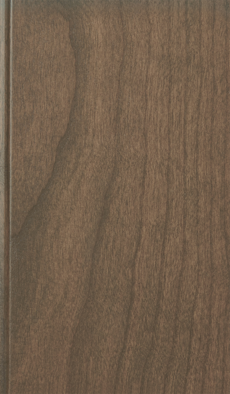
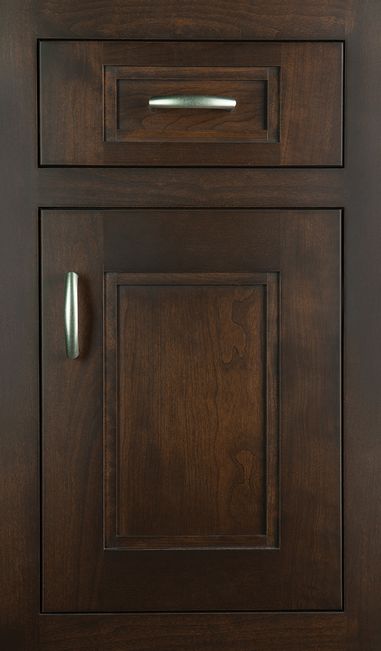
WALNUT
By far, the most popular wood species and natural stain color is walnut. You can see it here in our gallery.
Walnut is actually quite close to our hearts at Plain & Fancy. A favorite of our founder, John Achey, this wood species offers a truly unique color and graining. In fact, much of the graining is a huge challenge to source as grading the final cuts means locating the perfect variance between the center heartwood and the sapwood, which makes up 25 to 30% of each tree trunk.
In the end, true lovers of walnut and wood in general will appreciate the wide variety of shades and colors that this species can provide. And with a natural finish, these varied shades are exceptionally well highlighted, creating works of art that also function as durable, long-lasting cabinetry.
RIFT CUT WHITE OAK
Our second most popular wood and stain combination is rift cut white oak in the finish Narvik. See it here.
Whereas walnut tends to be a bit deeper in color and saturation, white oak is lighter and fresher-looking in many ways. Furthermore, rift sawn white oak offers a truly unique effect.
Rift sawn wood is cut in a specific way so that the annual rings are generally at around 45 degrees (or roughly between 30 and 60 degrees). This creates some waste when cutting the wood, but it’s ideal for a truly dimensionally stable effect (super durable) and a unique appearance that you simply won’t see anywhere else.
FIND YOUR PERFECT KITCHEN CABINETS AT PLAIN & FANCY
At Plain & Fancy, we’ve been a family owned and operated business for over 50 years. Our dedication and commitment to excellence in customer care is matched only by our skill and expertise in cabinet design and installation.
Allow us to service your unique cabinetry needs with state-of-the-art, custom designed and hand-cut cabinetry that’s built to last. To peruse our cabinet door styles, custom colors and finishes, and more, we invite you to visit our Design Center in Schaefferstown, or locate a showroom close to you.
Popular
The Key to Organizing your Kitchen
MAY.4.2023Kitchen organization Is the secret to achieving functionality and flow.
Cabinet Door Styles
JAN.9.2023What's In Store for the next Generation? It's no secret that interior design trends are always changing.
Best White Kitchen Cabinet Colors
SEP.23.2019White is currently a top kitchen color, and for good reason — it promotes a bright, open look that can instantly make even the smallest kitchen appear more spacious.
Latest Videos

50 Years As Family In the Kitchen Cabinet Industry
Plain & Fancy is proud to be a family run business, now in its third generation, for over 50 years.

How to Clean Your Plain & Fancy Cabinets
Learn how to properly clean your Plain & Fancy cabinets.

Fit and Finish
Every inset door and drawer are hand fitted one at a time to ensure a perfect fit.