
Cabinet Door Styles
While we often focus on colors and finishes, however, subtle elements are also bound to evolve. This is especially evident as we examine seemingly basic cabinet doors. Over the years, some of their most noteworthy changes have involved panel styling.
One of the biggest debates? Raised versus flat. Edging and vertical scoring have also changed our perception of the ideal modern kitchen. It's impossible to truly understand where kitchen design is going until you realize just how far it's come in a few short years. To that end, we're about to take you on a cabinet-based journey through time, exploring the intriguing changes that kitchen cabinet doors have undergone since the 1960s.
ORIGIN STORY
Our current concept of kitchen cabinets didn't appear until the 1920s. In the 1800s and early 1900s, most kitchens had minimal storage space. At the time, it was standard practice to store kitchen essentials on a main work table, or, perhaps, along a few open shelves. Upscale homes occasionally provided extra storage space in the pantry.
All that changed in the late 1800s, when freestanding options known as Hoosiers took over. A few decades later, the influential Christine Frederick (sometimes referred to as an early version of Martha Stewart) advocated for a more strategic take on kitchen layouts, engineered to fit the process of preparing and then serving food. While her efforts largely centered around the placement of industrial appliances, she also advocated for a departure from detached pantries.
Enter the Frankfurt kitchen. This was the first design to echo the aesthetic we've come to expect today. Cabinets were either placed at waist level or overhead. Depending on where they were located, they might include sliding or hinged doors. By the late 1920s, similar floor-to-ceiling cabinet layouts dominated catalogs. At the time, they were largely referred to as kitchen cupboards.
1950S
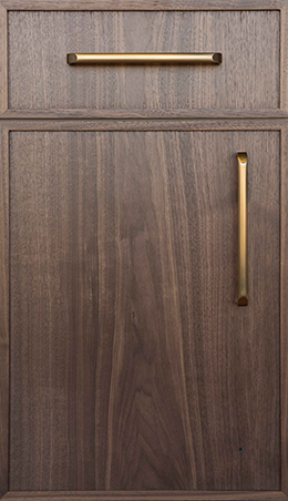
We may currently picture 'vintage' cabinets as being constructed from hardwood, but the 1950s delivered a departure from this style. Instead, the postwar boom saw a surge in steel cabinets. This provided an easy means of shifting steel manufacturing from weaponry to domestic functions. Many major manufacturers offered small cabinets known as "cabinettes," which were also constructed from steel.
While steel cabinets were common during the 50s, wood cabinets certainly didn't disappear. In keeping with the sleek look of midcentury modern, wood cabinets from this era often featured flat panels.
Vented cabinet doors were common at this time, as these often needed to accommodate old plumbing. Often, these doors incorporated perforated aluminum panels. Bright palettes were common, with vibrant shades of turquoise or blue frequently paired with similarly bright shades of laminate for the counters.
1960S
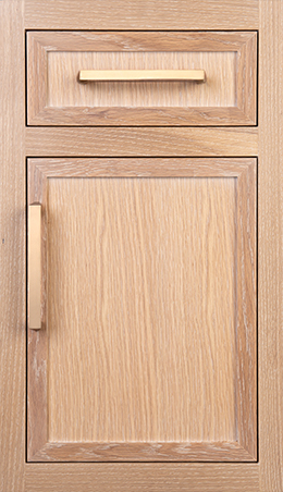
While some 50s kitchen trends held strong through the first years of the 60s, this decade ultimately delivered significant changes in interior design. At this time, warm wood tones — especially birch — were heavily favored.
Hardwood brought a more comforting feel to the average kitchen, which, as already mentioned, had previously featured metal cabinets instead of the wood that we take for granted today. Appliances often remained colorful, but this shifted to more robust hues that complemented the warm tones of wooden cabinets.
Flat panels continued to dominate dur
ing this decade, although many designers were willing to experiment with unique ornamentation. Some even played with shiplap-inspired styles. Hardware was understated, with many cabinets ditching pulls and handles altogether.
1970S
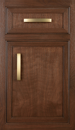
While the 1970s delivered many noteworthy changes to cabinet door design, the rise of raised panels was easily the most noteworthy. This change was spurred, in part, by the increased popularity of Colonial styles at this time. Even more impactful, however, were shifts in manufacturing solutions — especially as the machinery for building doors became more advanced and more economical.
Through the 70s and 80s, raised panels were prolific. These doors featured slightly raised center panels, which added instant dimension. Raised panels could be found in a variety of colors and finishes, with the trendy avocado, yellow, and orange hues of the time proving especially prominent. Above all else, however, the all-wood look that had emerged a decade before continued to take over.
Often, homeowners and designers weren't willing to call it quits with raised panels alone. In the 70s, these panels became a lot more ornate, with the flat look of previous kitchens giving way to fancy details. From bevels to etching, anything was fair game.
1980S
Early versions of the open kitchen began to appear in the 1980s, as the kitchen was no longer strictly thought of as a contained space. Advances in ventilation made it a lot easier to achieve an open concept.
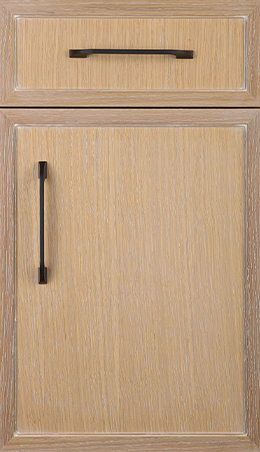
With this evolution came a slightly more restrained take on kitchen design. As such, the boldest features of the 1970s began to disappear. Wood continued to dominate, however, as did the raised panels that had already begun their takeover in the 70s.
While many types of cabinet ornamentation started to phase out during the 1980s, a few distinctive looks became more prominent. Among the most noteworthy? Raised panels featuring gentle arches. While curved rails were typically featured near the top of the cabinet, bottom arches also appeared on occasion.
1990S AND BEYOND
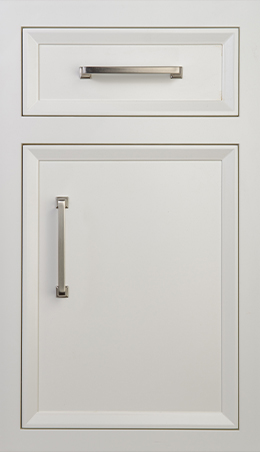
Raised panel doors remained a big deal in the early 90s, but the middle of the decade delivered a significant shift in aesthetics: the introduction of flat-panel, five-piece doors. This ushered in an age of clean lines and contemporary styles, in keeping with the minimalist looks that dominated nearly every aspect of interior design in the early 2000s and 2010s.
The iconic flat-panel or recessed look has frequently been referred to as the Shaker door. Much of the appeal of this design lies in its inherent versatility. While its general lack of ornamentation makes it a natural fit for contemporary kitchens, this look also works well for traditional spaces. After all, the Shaker style originated centuries ago, when a restorationist group of Christians known as the Shakers emphasized simple, minimalist living.
CHANGE IS AFOOT
After multiple decades of dominance, the Shaker door is finally giving way to a new look: a contemporary flat-panel style that is 3/4-inches thick. What really sets this new style apart, however, is its accent trim. This cabinet door's simple and sleek look reflects our continued preference for clean lines and uncluttered spaces — but this approach also recognizes that there is room for ornamentation within an otherwise streamlined style.
Versatility is a clear priority at this point. This is most easily seen in the sheer range of colors and finishes available. The warm look of natural wood remains desirable to many, but others clearly favor painted surfaces.
Even after selecting paint over hardwood, designers and homeowners face a wide array of choices. Neutrals provide a lot of contemporary appeal, but there's something to be said for experimenting with bolder and brighter colors. Typically, more vibrant hues are paired with the simplest cabinet designs, while neutral colors or natural wood are more likely to accompany etching or intricate ornamentation.
TOP DOOR OPTIONS
These days, while there's a general preference for the modern flat-panel looks identified above, people are willing to experiment with a variety of styles. As such, we've seen considerable interest expressed in all kinds of aesthetics. Our favorites at Plain & Fancy include:
- MILBROOK - As the original kitchen cabinet offering, Milbrook initially made its mark with square trim edges. This full overlay style remains quite popular, in part because it provides such an impressive blend between traditional and contemporary aesthetics.
- MILBROOK II - Similar to the original Milbrook door but featuring a flush inset overlay, Milbrook II has a wider face that works wonders for transitional spaces.
- BROOKSIDE - Offering a clean look that is visually appealing to many, Brookside features a small, but distinctive detail step at the inside edge.
- VESTA - The molded edge for this cabinet door is eased and rounded. The full overlay style has subtle details and is best suited to contemporary spaces.
- CHATHAM - A beveled edge adds flair to this picture frame style, which still retains a clean look. It's a perfect fit for modern, yet sophisticated spaces.
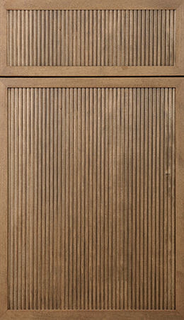
- ALEXANDRIA - As the latest addition to an already extensive lineup, Alexandria delivers compelling new details. Vertically scored, this is the best choice when you want to make a statement with a dramatic style.
THE BEST OF TRADITIONAL AND CONTEMPORARY STYLES
Whether you favor traditional styles, contemporary aesthetics, or something in between, you'll have no trouble finding an appealing design within the vast lineup at Plain & Fancy. We offer several options that conform to current trends, as well as a few more vintage styles to bring a comforting sense of nostalgia to your space.
To get your project off to a great start, visit our Design Center in Schaefferstown. You're also welcome to stop in at one of our many showrooms. Don't hesitate to get in touch if you need more information.
Popular
The Key to Organizing your Kitchen
MAY.4.2023Kitchen organization Is the secret to achieving functionality and flow.
Cabinet Door Styles
JAN.9.2023What's In Store for the next Generation? It's no secret that interior design trends are always changing.
Best White Kitchen Cabinet Colors
SEP.23.2019White is currently a top kitchen color, and for good reason — it promotes a bright, open look that can instantly make even the smallest kitchen appear more spacious.
Latest Videos

50 Years As Family In the Kitchen Cabinet Industry
Plain & Fancy is proud to be a family run business, now in its third generation, for over 50 years.

How to Clean Your Plain & Fancy Cabinets
Learn how to properly clean your Plain & Fancy cabinets.

Fit and Finish
Every inset door and drawer are hand fitted one at a time to ensure a perfect fit.
